It’s no secret.
We’re big fans of Power BI. It wouldn’t be a stretch to say that our clients are as well. Just wait until you see some of the dashboards we’ve made for them below.
A couple years back, our good friend Martin Faith wrote us a great article showcasing some of its features. After a recent internal tutorial by the knowledgeable Milan Mejzr: we’ve decided to expand upon it; delivering some actionable, step-by-step advice, straight to your browser.
A quick reintroduction: it’s a Microsoft data visualization program. Think Excel but with more orientation towards Business Intelligence.
To reiterate its advantages:
- Its reports are fully customizable; well beyond the awkwardness of pivot charts and tables. #aesthetics
- Its UI is accessible to anyone experienced in the Microsoft Office suite. #familiarity
- Its reports can be set up to refresh as your data sources do. #convenience
- Its reports can be shared across the web with people who don’t own the product, as long as you do. #CONVENIENCE
- Large varieties of sources can be integrated and then processed, compared, etc. #practicality
- It’s #EASY to get started…
And we’ll get into that right now.
First, you’ll need to download and install the desktop version. Fortunately, if you don’t have an Microsoft Office subscription, there is a free trial offered. Unfortunately, the desktop version is only available on Windows.
If needed, you shouldn’t have too much trouble running it on a virtual machine. For reference: the in-browser and mobile versions can only really be used for checking reports.
Three Easy Steps: Connect to a Data Source
Once installed, open a new project.
You’ll be greeted with a fair amount of complex looking tabs. Have no fear, we’ll work our way through it.
Just click ‘Get Data!’ on the ribbon and the fun will begin!
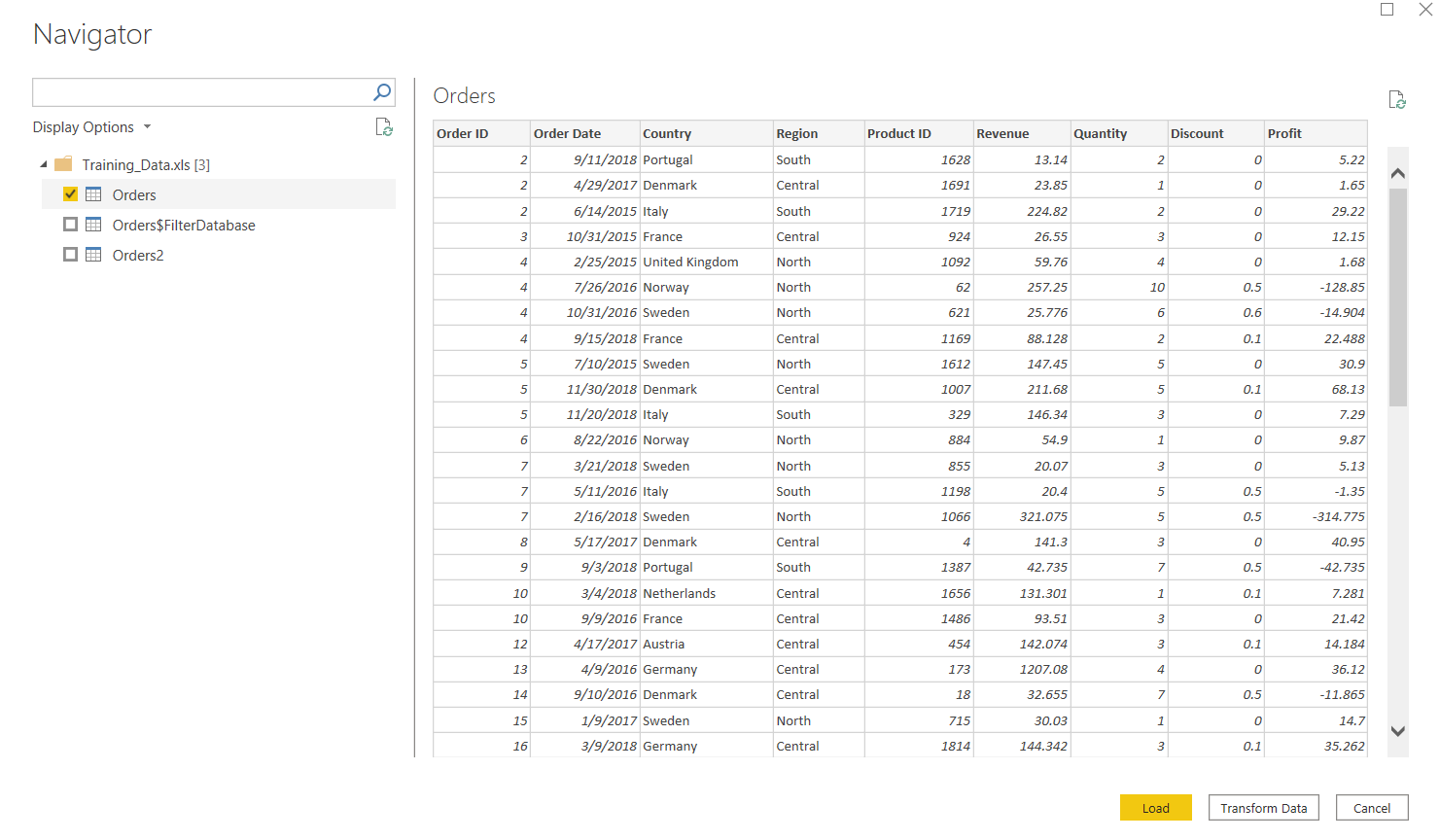
As you can see, there’s plenty of possibilities. Let’s keep it simple for now and use an Excel file. Here are some sample datasets you can use. Once you’ve made your selection, take advantage of the opportunity to “Transform Data”. Nothing ‘more than meets the eye’ about this, it’s just best to make sure your data is formatted the proper way before working with it.
Three Easy Steps: Prepare Data
A couple quick things about this new screen you’ll see in Transform view.

The right side will show any changes you make to your data. You can quickly reserve any applied actions by clicking the X to the left.
Below the ribbon in the middle, you’ll find the columns of your Excel spreadsheet. Power BI will attempt to assign them data types automatically. The icon next to the column name will tell you what data type each one is so far. This is the first place you should check. A column that is meant to contain numbers, if falsely assigned the Text data type, will cause problems. If you find an error, just click on the icon and assign the column the data type it contains.
Another common action you’ll want to do is filter out any irrelevant data. This will ease the load on your processor when working with larger data sources. Just click the arrows on the right side of columns and you’ll be presented with a helpful drop down.
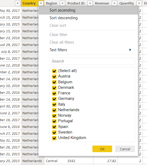
Pulling data from suboptimal sources means you might have to spend a lot of time on this screen, converting data from the format that it is provided in into a format that can be worked with. That’s out of the scope of this guide, but there will be some links to more advanced material at the end.
Once you have everything looking how it’s supposed to – that is, neat and organized, like an Excel sheet – hit “Close and Apply”
Three Easy Steps: Visualize the Data
Finally, THIS is the real meat and potatoes of Power BI! Back on the main screen, turn your attention to the three vertical tabs on the left.
The top, which should be currently open, is the report tab. In the middle you’ll see a blank white canvas which you will use to create your masterpiece!
The middle is where you’ll find all your data. It’s very similar to the data transformation window from the previous step.
The bottom is the modelling tab. This is more advanced than the data tab. It’s functionality is similar to defining table relationships in database applications like Microsoft Access.
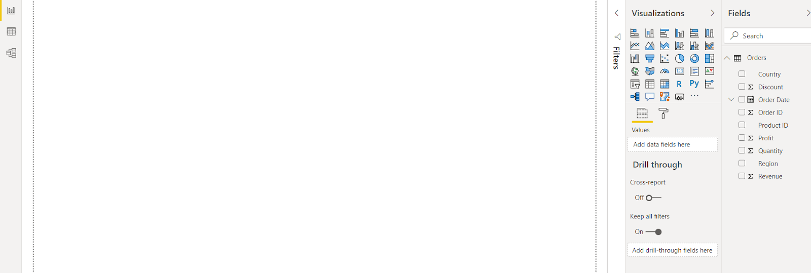
Back up to the report tab, let’s get underway. On the right most pane, titled “fields” there will be all of the columns from your sources. Experiment with dragging visualizers into canvas clicking the check boxes and be amazed.
That’s really ALL you need. You can teach yourself from this point. Just play around with the various visualizations, selecting them and assigning fields. It’s possible to customize the look of anything by interacting with the options on the bottom half of the visualizations menu. Name an axis or two, add some borders, etc.
Here’s what we were able to whip up with our sample data set:
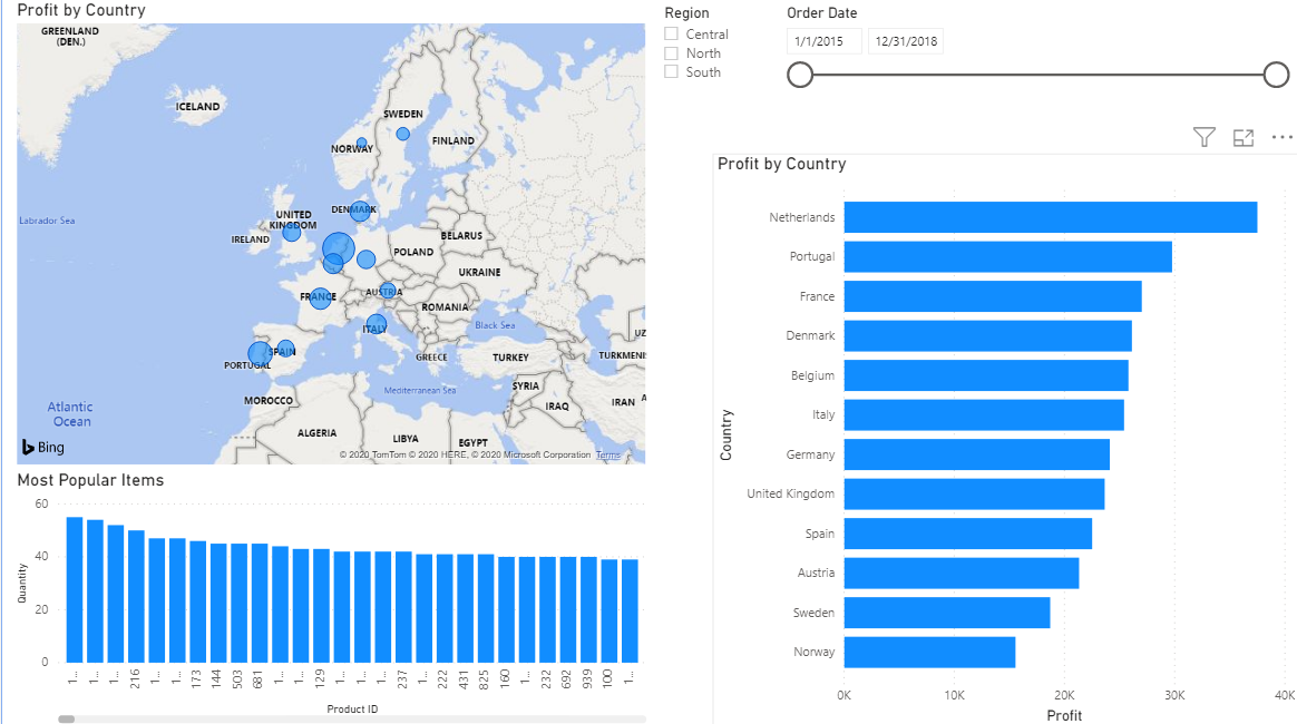
Once you have something up to your expectations: go to the file menu in the top left hand corner. Save your work. Now you can either export to a different file type or publish your work to the online Power BI service. This latter option gives you a shareable link which you can send to ANYONE.
Check it out. Here it is from the picture above.
Three Easy Steps: Bonus Tips
- The most powerful of all the visualizers is the ‘slicer’. You can see it above, on the top right section of my canvas. Checking any of those boxes - control click to select multiple at a time - will result in the rest of the content focusing on just that or those regions.
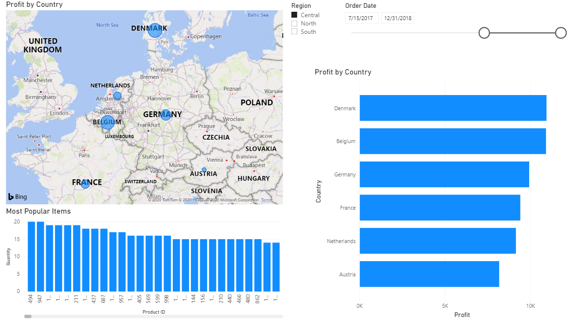
Pretty cool, right?
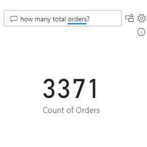
- There’s also the fun little “Q&A” visualizer. You can type a question into it and Power BI will do it’s best to interpret it and provide an answer. Fun but honestly, robots are kind of terrifying.
- You have two main options to manipulate your data sources: Measures and Columns. They’re both written in the PowerBI formula and query language DAX, which shares many functions with Excel. Anyway, measures are best for temporary one time queries. Good for when you don’t want to abuse your computer’s processor every refresh if you happen to be working with a huge data source. Columns are what they sound like: just taking data from the source and manipulating it so it can be cleanly displayed and processed. Sometimes necessary.
The Applications
After raving for a thousand words: of course we want to show off.
Here are some of our favorite dashboards and reports that we’ve made.
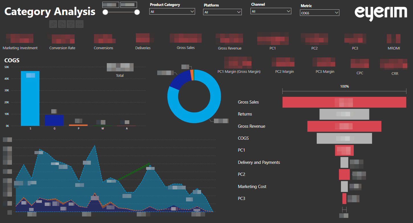
Eyerim approached us with a very particular problem. They needed a way to evaluate the effectiveness of their marketing for individual product segments of their business. As a result of close cooperation on the project, each customer session is scored mainly based on the products viewed. Within ROIVENUE, these raw customer paths are then connected with data from their CRM system and compared. Thanks to the data from Eyerim’s internal system, marketing activities can be evaluated independently for each product category and three different variations of profit can be seen: once after COGS is removed(PC1), again after logistics cost is removed(PC2) and a final version after subtracting marketing costs(PC3).
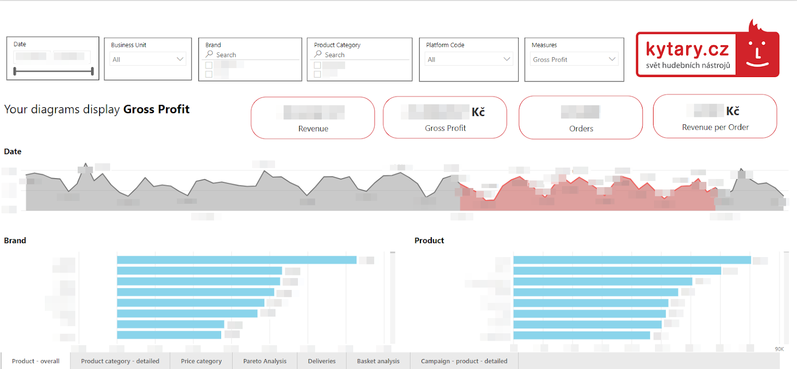
Switching gears, Kytary was looking for a complex product analysis. That’s exactly what we delivered. They can evaluate the profit and importance of each item and from there, make decisions about their product portfolio. Thanks to ROIVENUE, individual products can even be connected with their own specific online marketing costs. You might be able to see at the bottom how many tabs this report has. We can really implement and track any metric you need, even ones that are yet to be conceptualized.
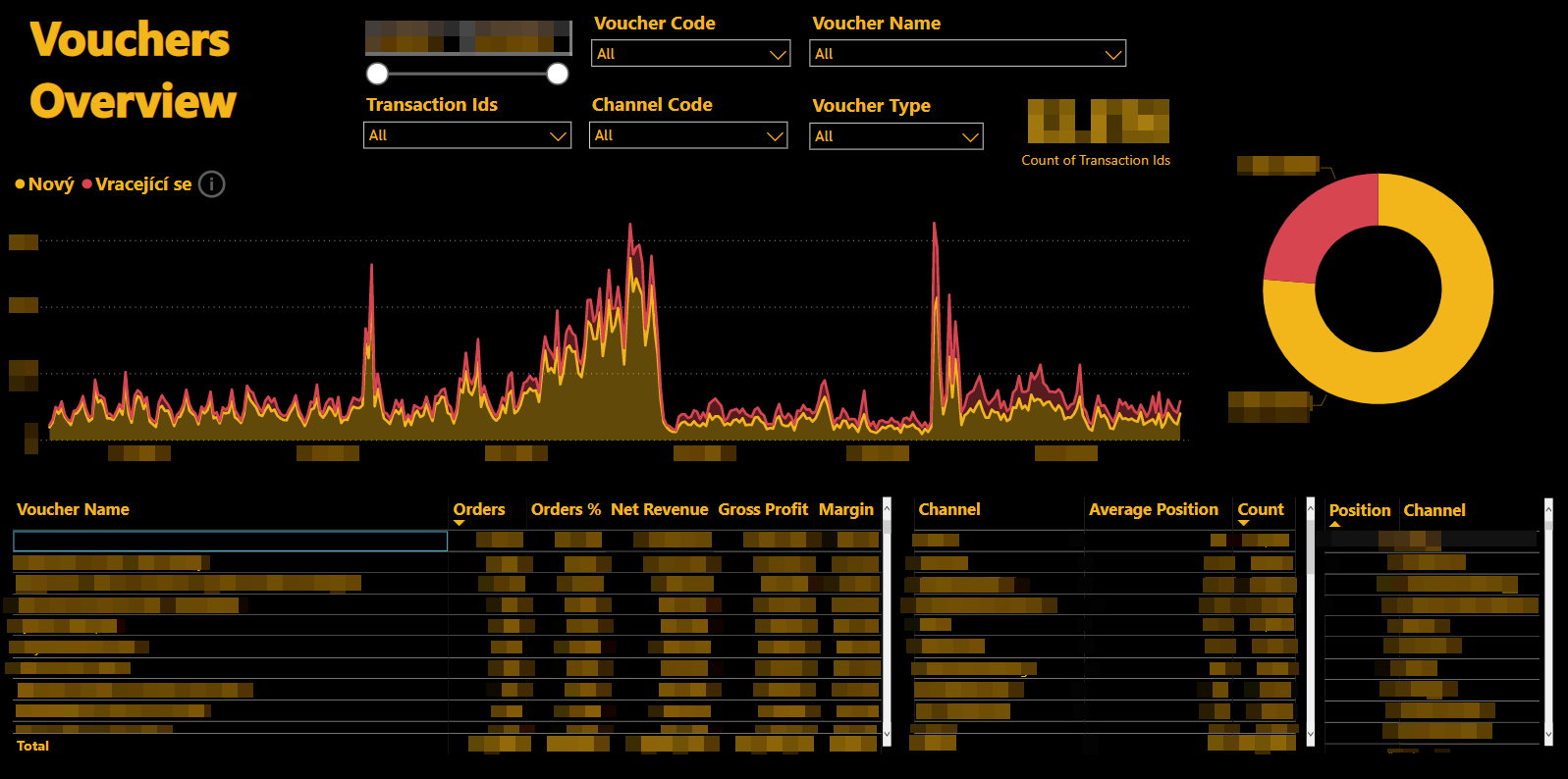
Last but not least, this client needed two main features. They use a lot of vouchers in their marketing and wanted a way to see: first, which vouchers bring in new customers(yellow), and which are utilized by returning customers(red). Second, was the effect of the voucher strong enough or did they have to pay for the customer twice? Meaning, when examining a specific voucher, were the customers coming to the website through free and cheap channels or was further marketing investment necessary?
In short, the client wanted to avoid spending money paying for clicks while also losing revenue due to voucher usage on top of that. By connecting the voucher codes shared with us by the client and the customer conversion paths we were able to make magic happen.
The Competition
Just because we’re loyalists doesn’t mean there’s no credit due to the competition. Google Data Studio is another visualization tool. It’s actually free. Many think it’s easier to learn.
It’s hard to master that relationship between functionality and accessibility. While PBI leans towards the former, Data Studio is more of the later.
At the end of the day, it’ll probably come down to your preference. Do you prefer the feel of Microsoft or of Google?
Conclusion
This is nothing but a short introduction. As with any complex software: the sky’s the limit. All you need to get started is here but the more you know the more powerful the program becomes. It’s applications are endless.
If you haven’t given it a try yet, you have nothing to lose.
Further Reading:
Some of Our Other Fantastic Articles:
